How to Choose Interior Paint Colors for Your Home
You've chosen a warm cream from the store, painted one wall, and waited for evening.
September 13, 2026 · 12 min read
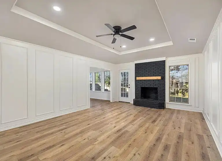
You've chosen a warm cream from the store, painted one wall, and waited for evening. Under the lamps, it looks closer to mustard. By morning, the same wall appears calmer, almost beige, and now you're wondering whether the paint is wrong or the room is revealing something the sample never showed.
That hesitation is the starting point for how to choose interior paint colors in a real home. Paint isn't a fixed object you pick from a card. Pigment, natural light, bulbs, wall texture, flooring, cabinets, trim, and nearby colors all influence what you see. A successful choice begins when you stop treating the swatch as the finished answer and start reading the room as a system.
What Really Drives a Good Paint Color Choice
A homeowner once showed me a room with fresh paint on three walls and a very confident opinion about the sample. In the store, the color had looked like a soft neutral cream. On the wall beside honey-toned flooring, it leaned yellow. Near the cooler white trim, the same paint looked pinker. At night, the lamps made the whole room feel heavier than expected.
The paint hadn't changed. The conditions around it had.
The room edits the color
Every surface contributes. Oak flooring can pull warmth out of a neutral. A gray backsplash can make a beige paint appear more yellow. A cool LED bulb can emphasize blue or violet undertones that barely showed in daylight. Even the white used on trim affects how clean, creamy, bright, or muted the wall appears.
That's why a small paper chip is only a starting point. It's printed or painted under controlled conditions, while your wall is viewed beside furniture, flooring, window glass, countertops, and artificial light. A color that succeeds in a showroom may fail when it meets a brick fireplace or an existing cabinet stain.
Job-site rule: Don't ask whether you like the swatch by itself. Ask whether its undertone belongs with everything that's staying in the room.
The practical process is simple. First, identify the room's light and fixed finishes. Then decide how much energy the room should carry. Only after that should you compare paint cards or tester quarts.
Color choice serves more than appearance
Interior preferences aren't divided between one universally safe palette and everything else. A major 2017 U.S. survey found that 58% of Americans preferred vibrant home colors over neutral tones, while 62% named blue as their favorite wall color. The same survey reported blue as calming for 45% of respondents, which helps explain why cool colors often suit bedrooms and other restful spaces. See the survey findings on home color perceptions for the full context.
Those findings support a balanced approach. Use a broadly compatible neutral where resale or continuity matters, then bring in blue, green, or another expressive color where the room's purpose gives you more freedom. Good paint selection is both visual and functional. It should look right with the finishes you have and feel appropriate for the way you live.
Read the Room Before You Pick a Swatch
Start with the room, not the paint counter. Three filters will eliminate most unsuitable choices before you spend money on samples: light direction, room function, and fixed finishes.
Light direction sets the starting temperature
North-facing rooms generally receive cooler, less direct light. A cream with a noticeable gray or blue base can look stark there, so warmer whites, beige-leaning neutrals, and softened taupes often deserve the first test. South-facing rooms receive warmer light, which can intensify yellow, peach, or red undertones. A warm putty may become noticeably golden, while a blue-gray may lose some of its coolness.
East-facing rooms change most dramatically through the morning, and west-facing rooms can become especially warm late in the day. Don't choose from a room's early appearance if you use it mostly in the afternoon or evening.
Function determines intensity
A bedroom usually benefits from a color that recedes rather than demands attention. Muted blue, softened green, and gentle warm neutrals can support a restful atmosphere without making the room feel flat. A study may handle deeper color because concentration and enclosure can be useful there. A bathroom can take more personality, especially when it's separated from the main living areas.
The room's job should guide saturation and depth. A dramatic color that feels inviting in a powder room may become tiring across a large living room with strong sunlight.
Fixed finishes impose the real constraint
Make a list of what isn't being replaced. Include flooring, cabinets, countertops, tile, grout, brick, fireplace stone, metal finishes, appliances, and large furniture. A warm putty next to honey oak may look coordinated, but next to walnut it can become too yellow. Against gray-washed laminate, it may look peachy or disconnected.
If your kitchen finishes are part of the decision, compare the wall shortlist with the countertop materials discussed in this quartz and granite countertop guide. The point isn't to match every surface exactly. It's to avoid placing competing undertones side by side.
Use this order: light narrows the temperature range, function sets the color's intensity, and fixed finishes determine which undertones survive.
Decode Undertones, Color Temperature, and Light Reflectance
Paint names are useful for shopping, but they don't tell the whole story. A “gray” can lean blue, green, violet, or beige. A “white” can look crisp beside warm wood or dingy beside a cooler trim. The hidden color beneath the main color is the undertone, and it often becomes more visible after the paint covers a large wall.
Color temperature describes the warm or cool character of the paint. Warm colors commonly support wood floors, brass hardware, and beige stone. Cool colors can complement blue-gray tile, stainless appliances, and crisp white finishes. Neither category is automatically better. The mistake is choosing one without checking what surrounds it.
LRV gives you a practical brightness reference
Light Reflectance Value, or LRV, measures how much visible light a color reflects on a scale from 0 to 100. Colors below 50 absorb more light and generally read darker, while colors above 50 reflect more and generally read lighter. This makes LRV useful before you commit to a color, especially in hallways, interior bathrooms, and rooms with limited daylight. The technical guidance on LRV and undertones explains why both variables need to be evaluated together.
Consider a blue-gray with an LRV of 18 in a windowless powder room. It may feel enclosed and cave-like. A related blue-gray with an LRV of 58 can reflect enough light to feel more like soft daylight. The higher value doesn't automatically make it the better color, but it changes the room's perceived volume and brightness.
Hold a clean white sheet beside a paint card or sample. The white reference helps expose whether the color is leaning yellow, pink, blue, or green, and it makes relative brightness easier to judge.
These are screening tools, not guarantees. The final decision still belongs on the wall under the light your household uses.
Test Samples the Way Painters Actually Do
Small chips taped to a showroom wall can help you build a shortlist, but they're poor evidence for a final decision. Paint is viewed at a larger scale in your home, and the surrounding wall, floor, furniture, and light can change your judgment quickly.
Buy sample quarts rather than relying only on paper. Paint at least two-foot squares on more than one wall, preferably on walls that face different directions. Apply the full number of coats you expect to use. A single thin coat can make a color look weaker, patchier, or lighter than the finished result.
Move the sample through the day
East Texas rooms with western exposure can look very different by late afternoon. Review each sample in mid-morning, late afternoon, and after dark under the room's actual bulbs. If you only inspect the color in store lighting, you're judging the sample under conditions that don't exist at home.
Poster board makes the process more useful. Paint the board, allow it to dry properly, and move it between walls. Covering the edges prevents the existing wall color from framing the sample and influencing your perception. Compare all candidates at the same time, not one today and another tomorrow. Your eyes will otherwise remember an impression rather than make a direct comparison.
Place a clean white sheet beside each sample. This can reveal whether a gray is drifting blue or violet, whether a cream is becoming yellow, and whether two apparently similar neutrals have different brightness levels.
Practical observation: The color that wins in daylight can lose under lamps. Don't choose until you've seen both versions.
Let the samples remain in place for 24 hours before making a preliminary commitment. For a larger remodel, a longer decision window is even safer. The most common avoidable mistakes are skipping the second coat, painting over a strongly colored wall without controlling the background, and trusting a tiny store chip instead of testing the actual paint.
For a visual explanation of sample testing, use this. Watch it alongside your own brushouts, then judge the samples in the room where they'll stay.
Trend Colors Versus Resale-Safe Neutrals
Expressive colors can make a room feel intentional, but they also increase the cost of getting the undertone and brightness wrong. Saturated green, terracotta, moody navy, and dusty plum can work beautifully in a powder room, office, dining room, or restrained accent wall. They're also reasonable in a home you expect to occupy for many years, where personal enjoyment matters more than broad buyer approval.
Warm neutrals solve a different problem. Warm whites with a touch of beige, soft warm-leaning greiges, and muted taupes tend to connect more easily with common wood, stone, and tile finishes. They also provide a quieter background when a property needs to appeal to future buyers, tenants, or a wide range of furnishings.
A major industry survey found that 81% of professionals recommend warm neutrals when selling a home, while 42% of homeowners say in-store paint displays have the most influence on their color selection. Those findings appear in the Fixr paint and color trends report, and they point to a practical warning: retail displays can shape decisions even though they don't reproduce your room's light or fixed finishes.
Trend coverage has increasingly highlighted warmer earth tones, richer browns, burgundy, green, and quiet neutrals. The 2025 paint trend discussion from Havenly is useful inspiration, but a trend list can't tell you whether a dark color will work in your west-facing living room.
For resale, keep the main circulation areas conservative and place stronger color where repainting is easy. For personal use, choose the color you'll enjoy, but still test it against the room's worst lighting condition.
Room-by-Room Picks for East Texas Homes
A paint color should solve a room problem. In East Texas homes, that often means managing strong sun, tall spaces, wood cabinetry, compact bathrooms, and rooms that connect several different finishes.
Living rooms
Vaulted ceilings and large windows can make a living room feel airy during the day and cavernous at night. A lighter LRV can help preserve that sense of volume, especially when the ceiling is tall and the room has limited evening lighting. Warm whites and gentle warm greiges usually cooperate with wood floors, while a muted blue or green can add character without becoming visually loud.
Use flat paint on the ceiling, eggshell on the walls, and satin on trim. The mistake to avoid is choosing a wall color so dark that the trim line becomes harsh and the upper volume loses definition after sunset.
Kitchens
Cabinetry and backsplash materials should lead the palette. With oak cabinets, test creams, warm whites, and softened taupes against the actual wood. With painted cabinets, compare the wall to the cabinet sample under both daylight and the under-cabinet lighting. A backsplash-driven neutral often holds together better than a color chosen from a trend card.
Before changing wall paint around existing cabinetry, compare the scope with this guide to kitchen cabinet refacing versus replacement. The common error is treating the walls as an isolated surface when the cabinets occupy far more visual space.
Bedrooms and bathrooms
Primary bedrooms exposed to harsh afternoon sun often need a color that stays calm as the room warms up. Muted blue, softened green, or a warm neutral can prevent the walls from feeling overly active. Bathrooms with limited ventilation need a moisture-tolerant paint system and a sheen appropriate for cleaning. Light-reflective colors can help compact bathrooms feel more open, but they still need to be checked against tile and grout.
Hallways, entries, and bonus rooms
Hallways should connect adjoining rooms rather than introduce a competing undertone. Use a neutral that can sit beside each room's flooring and wall color, and avoid judging it only under the entry fixture. Bonus rooms over garages can run hot in summer, so a pale, calm color may feel less oppressive than a deep saturated shade.
Across all rooms, the finish matters as much as the color. Flat ceilings hide surface irregularities, eggshell handles normal wall traffic, and satin trim withstands repeated contact. Always check the existing furniture before approving a color, not just the empty room.
Your Final Color Decision Checklist
Before scheduling the painters, run the choice through a fixed sequence. This keeps a promising swatch from becoming an expensive whole-room correction.
Confirm the light. Record the window direction and note whether the room is used mainly in daylight, lamplight, or both. Check the bulb color temperature because warm and cool bulbs can pull the same paint in different directions.
Photograph fixed finishes. Capture flooring, cabinetry, countertops, tile, grout, brick, appliances, trim, and the furniture that will remain. Review the photos beside your candidate cards, but don't treat photos as a substitute for physical samples.
Narrow each room to three candidates. Select colors with compatible undertones and an LRV suited to the room's purpose. A short list is easier to compare than a fan deck full of near-duplicates.
Paint large samples. Use real sample quarts and brush out large areas on at least two walls. Apply the intended coats, and use poster boards when you need to move samples or reduce the influence of the existing wall.
Check the full light cycle. View the samples in the morning, around midday, in late afternoon, and under evening lamps. Put a clean white sheet beside them to expose undertones.
Compare against the actual room. Stand the sample beside flooring, cabinetry, furniture, trim, and hardware. Don't judge it only against a white sheet or an empty wall.
Verify the finish. Choose flat for ceilings, eggshell for most living-area walls, and satin for trim or surfaces that need more cleaning. Match the sheen to traffic and surface condition.
Buy sample quarts before gallons. Confirm the color on the wall before purchasing the full quantity. A paint card can't reveal how a color will react to your windows and finishes.
Use a 48-hour decision window. Let the samples remain visible through changing conditions. Skipping this step is how a color that looks acceptable at noon becomes wrong at night.
Label touch-up paint. Keep a clearly marked can with the room name, color, sheen, and date. Future repairs are much easier when nobody has to guess which neutral belongs on which wall.
Before the crew arrives: Order the paint three days before the planned start, confirm tape and drop cloths, and make sure the selected finish is available.
Schedule a walkthrough after the first coat dries, preferably during the evening as well as the day. Catching a mismatch early is easier than discovering it after every wall, door, and piece of trim is complete. For broader project coordination, this final walkthrough checklist can help you review the work systematically.
A final warning from the field: don't test only on white paper, ignore trim color, or forget the furniture. The room is the test environment, and the correct paint is the one that continues to make sense after the lamps come on.
Home Pro's Remodeling & Repairs handles interior remodeling work that can include painting, drywall, carpentry, and trim, with on-site consultations for homeowners planning finishing decisions. Visit Home Pro's Remodeling & Repairs to discuss your room conditions, fixed finishes, paint samples, and remodeling scope with an East Texas contractor.
Home Pro's Remodeling & Repairs, (903) 920-2969
Call (903) 920-2969More articles
7 Best Outdoor Kitchens: Designs, Costs, and Build Tips
Many outdoor kitchen problems begin on day one, when the layout, cover, and utility routes get decided before anyone looks closely at the budget.
Bathroom Vent Through Wall: Complete DIY Installation Guide
You've just stepped out of the shower on a humid East Texas morning.